Thursday, December 31, 2015

A Walk Through W.H. Stanton House, Kitchen...

Now you had better grab your socks because this is an amazing kitchen. Even before our renovation (first photo below) this was a huge and impressive kitchen. The view is a lovely 100+ yr. old pecan tree. Before the cabinets were 80's (or earlier) style, thin wood with drawers that were hanging on by their finger nails and an awkward, and small, oven placement. It is right next to the door way and really makes the room feel closed in. The linoleum on the floor was old and, well, just really old and ugly. There was a soffit above the cabinets that didn't need to be there. Also, can we dicuss the paint color for a bit. It was very popular back in the 80's & 90's but not the look we are going for today. Also, notice the lack of lighting in this kitchen. All we had to begin with were two 4 light fan fixtures- not optimal for task work. 


Here is our finished kitchen. We switched the oven and the fridge while moving the fridge away from the door just a few inches which really opened up the flow into the kitchen from the dining room and butler's pantry. by moving the fridge there is a sight line all the way around the kitchen and the natural light penetrates the whole room. 


The floors were relieved of their linoleum burden and Heart of Pine flooring was discovered underneath. Custom cabinets painted a bright white then finished with an antique glaze in new configuration, played up with more drawers for a modern kitchen. The wall cabinets were extended up to 42" as opposed to the former 36". We combined the oven with the stove in one unit to free up counter space and create a better work triangle. 10 recessed lights were added along with a pendant over the new built-in breakfast area. You may also notice the bead board ceiling that was discovered when we removed the soffit. It is so beautiful.


Here's our amazing view.

Check out this beautiful mini subway tile and the hood brackets. 


I am so in love with this HUGE sink. 


Saturday, December 26, 2015

A walk through the W. H. Stanton House, inside...

The ENTRY


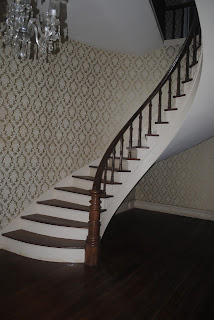
Above you can see the entry way before the renovation and below is after. I'll point out the differences. First, we repainted. The yellow was unflattering and looking dull after so many years. The trim was updated to an antique white which really made a difference. I could not tell that the trim needed painting before we started but it made all the difference after. The floors were refinished with a period correct finish. We replaced the light. It was an old boob light but we stole the chandelier from the library, polished it (that took about 10 hours of elbow grease) and washed all the crystals. It looks amazing in the entry. The newel post was a half white, half stained number that I stripped down, sanded and refinished. unfortunately, the bottom quarter was badly abused and repaired with MDF so it could not be stained to match and was painted. However, the finished newel post looks 100% better and I am so happy with it. 


The LIVING ROOM

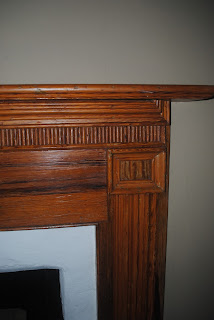
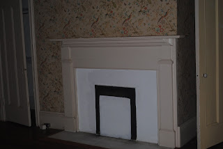
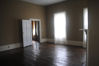
This living was ROUGH when we purchased the house. The mantle had been savagedly ripped out, the original tile had been covered over with square ceramic bathroom tiles, most of the baseboards were covered with radiators and the 80's style planation shutters blocked so much gorgeous light. We patched and repainted. We installed a new heat systerm that eliminated the radiant heat. The old windows were replaced and we removed all the shutters as well. Luckily, there is an awesome antique market in Atlanta, called Scott's Antique Market and we scored a deal purchasing 3 mantles at once to cover all that had been stolen. Below are the images just before the final cleaning. 

You can see our beautiful new mantle and tile surrounds


 Now you can actually see all the wonderful baseboards that we reconstructed and painted.


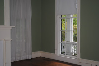
Look at the fantastic view that was hidden behind those plantation shutters. There isn't a room in this house with a bad view. 


Up next: the dining room, kitchen and new butler's pantry. Here's a sneak peek.


Wednesday, December 16, 2015

On The Market: 1896 Neoclassical Home Tour

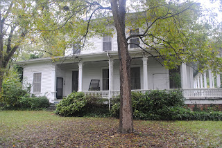
We have finished our first project in Social Circle, Georiga. This labor of love was how I fell in love with historic homes all over again. Like many home lovers, I love older homes because of their unique qualities and details. The W.H. Stanton House embodies both. When we purchased this home in October 2014 it had sat empty for 5 years due to foreclosure. The paint was peeling, mantles had been stolen and most of the historic beauty was hidden under former trends. Above is my favorite view of the house, walking up Highlighter Trail. In the following blog posts I will walk you through and share the renovation secrets and hidden treasures that we discovered along the way. 
This front elevation used to look like a farmhouse before the column salesman came to Social Circle. The porch roof was under the balcony and met up with the side porch roof. 

We painted all the porch ceilings Haint Blue. 

Early morning a few days after closing, I was waiting for the locksmith and took some beautiful shots of the grounds before the leaves turned. 

Here's Poplar Ave. that runs next to the property. The original lot ran all along this road covering 2.5 acres in the heart of the National Historic Registered district. 
Next time we'll step inside and see the entry hall, office, living room and dining room. They feature Brass and crystal chandeliers, judges paneling and an intricate inlaid wood floor design. 

Get a sneak peek of the interior on our Circa listing here

Tuesday, November 10, 2015

More Master Bath...

While reading "This Old House Magazine" Nov/Dec 2015, I came across this gorgeous master bathroom by Barbara Westbrook that I decided to use as inspiration for the new master bathroom in the Monticello house.


I love the tone but think our bath will need to be brighter, a pale color that Barbara Westbrook favors for her baths. Since our bathroom will not have a window but a transom from the mudroom behind it to bring in natural light, the paint color will be bright but inviting.

What I love most about the image above is that everything, the vanity, the trim and the walls are all the same color so they meld and complement.
You saw our floor plan in the previous post so I am going further and drew an elevation of the vanity wall inspired by this image.

Friday, November 6, 2015

A bathroom upstairs....Yes, please

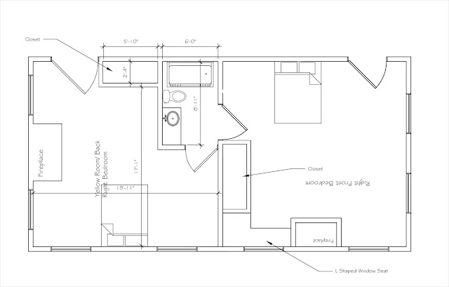
Currently there are no bathrooms upstairs just four large 20' x 20' bedrooms. To add needed bathrooms we are creating 2 jack and jill bathrooms between each set of adjoined bedrooms upstairs. Since the walls in the two bedrooms were all ready pushed out to make closets for each room, we are adjusting those walls to make the bathrooms and put back closets in each room.

Thursday, November 5, 2015

From an old kitchen to a new Master Bath...

We are starting on the demolition of the some parts of the 1850 Monticello home. The first room to be gutted is the old 1960's style kitchen. All of the cabinets and appliances were removed as well as the bulkheads over the cabinets. The pantry was also removed to make the entry from the foyer wide open. The ceiling was also pulled down the find the original 12' foot ceilings. This room will now become the master bath as it is located right off the master bedroom and there is no other serviceable bathroom downstairs. The partition you see on the bottom right of the picture of the kitchen will become a wall. The area on the other side of the wall will become the mudroom since the backdoor is right there. This space will create a huge and functional mudroom that will also be a walkthrough to the new kitchen, game room and new powder room. Below you will find the new plans and layout for the proposed master bath. It will feature a large walk in shower, a 6' double vanity, water closet and clawfoot tub. Next to the vanity are linen shelves.